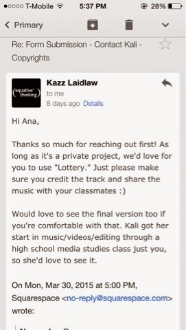
Here I have the rights to the song "Lottery" by Kali Uchis that I will using for my music video. I'm so excited to be able to use this song because she's someone I admire a lot and I want to make this music video as amazing as possible. It's interesting how they said that Kali herself also was in a media class in high school, that just motivates me more to keep doing this sort of thing.
Wednesday, April 1, 2015
Monday, March 30, 2015
Updates on Magazine
This is what I have so far for the magazine. I still need to finish the two page spread and touch up some stuff in the title and contents page but that won't take long. I've had a pretty good experience working with In Design, it's way more efficient than Photoshop. I guess it because of the fact that this program was made for making magazines/books/etc.
Wednesday, March 25, 2015
Inspirations for Music Video
These are a few of the videos that have really caught my eye and have inspired certain elements of my music video the A Level portion. From Frankie Cosmos "normcore" style to Bjork's experimental way of being, there are a lot of things I've picked up from all of these music videos that have influenced my choices. I am a fan of music videos that don't really have a set storyline to them kind of like Alvvays' video along with Frankie Cosmos'. The art direction in Mac Demarco's video was so impressive because he wasn't really known at the time so for him to make a video that great, really motivated me since my budget is basically $0. Everything from the lighting to the make up and the set overall flowed so nicely. I want the girl in my music video to be wearing dressed very differently and that's where Bjork's video comes into play. She's known to be extremely weird and I really appreciate that and I want to incorporate some of that weirdness into my own.
Tuesday, March 24, 2015
BIG CHANGE
So turns out that for my music video I had to completely change my idea because of some inconveniences along the way. Probably came across some problems while recording their song and won't be able to release in time for me to make the music video. But that's completely fine since I had an alternative all along just in case something like this happened. I was able to get in touch with musician Kali Uchis and she gave me the copyrights to her song "Lottery" off her new EP "Por Vida". I'll post the picture of the email her agency sent me allowing me to use the song when I post the full video later on.
Monday, March 23, 2015
InDesign
So when I decided to switch to InDesign I had no idea how to even use it and this Tutorial helped me out so much! It's not very different from Photoshop but there are a few things that you need to know before you start your document such as how to start out with the right size and if you want to make a two page spread then you need a different size instead of making two separate pages to make it easier while editing the whole thing. A lot of the tools are also placed in different spots and theres way more features for the type of work I'm doing. In Design was definitely way better choice because everything ends up looking more clean cut which is something that I was really aiming for especially for the aesthetic I selected for my magazine.
Thursday, March 12, 2015
Interview with band
For my 2 page spread I was thinking about interviewing a local band named Probably
I've been coming up with questions to ask them:
- Tell us the brief history of your band
- Who are your musical and non-musical influences?
- Who writes the songs, what are they about?
- Tell us about your next shows and why we should be there
- How long have you all known each other? How did you meet?
- When did you form your band? What inspired you to make music together?
- What are your rehearsals generally like? Do you have a set time each week in which you practice or are rehearsals more spontaneous?
- What advice do you have for people who want to form their own bands?
- When and why did you guys start playing?
- How was the recording process for the EP?
Wednesday, March 11, 2015
Contents Page/ Draft
This week I started to work on my contents page and I started off by keeping the design very simple how stated in my previous posts. I don't want to add too much color to the page because I'm gonna use about 4 images in this page and I don't want it to get crowded and overwhelming for the reader. What I would like to add is some more depth to it, I'm not sure if I should do that when I add the pictures or with the text, lines, and shapes.
I started to add a few more details to the page and I kept the same color that is found in the front page because I want the magazine to have a certain color scheme with every issue. The lines were added to separate the different topics that will be discussed. I added the color under the words because I thought it would make them pop more unlike in the first draft where they look like they're floating around the page. Now looking back at my two first drafts, I noticed that the "CONTENTS" in the first one is different than the second one because I forgot to bold it and that's definitely something I have to go back to change because I don't want the title of the page to be the same as the subheadings, I feel like something as small as that will still take away from the main one. Even though all the text is italicized Times New Roman, the sizing and bolding of the text is important when it comes to getting the viewers attention.
As of now I'm using Photoshop CS6 to create my magazine but I want to try InDesign because I feel like that could be a better alternative that will allow me to get a better result for what I'm trying to achieve with this magazine, as far as the look of it goes.
Subscribe to:
Posts (Atom)


